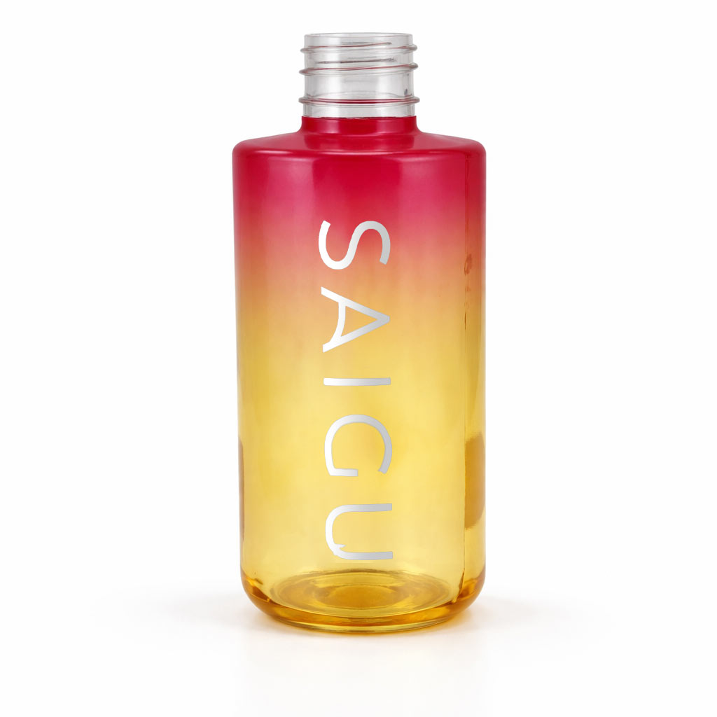

In this project for Saigu, we have transformed a glass container into a visual experience that evokes a sunset and a sense of well-being. The challenge was to create a design that reflected the nature of a high-end Body Oil, playing with light and metallic finishes to stand out in the conscious cosmetics sector.
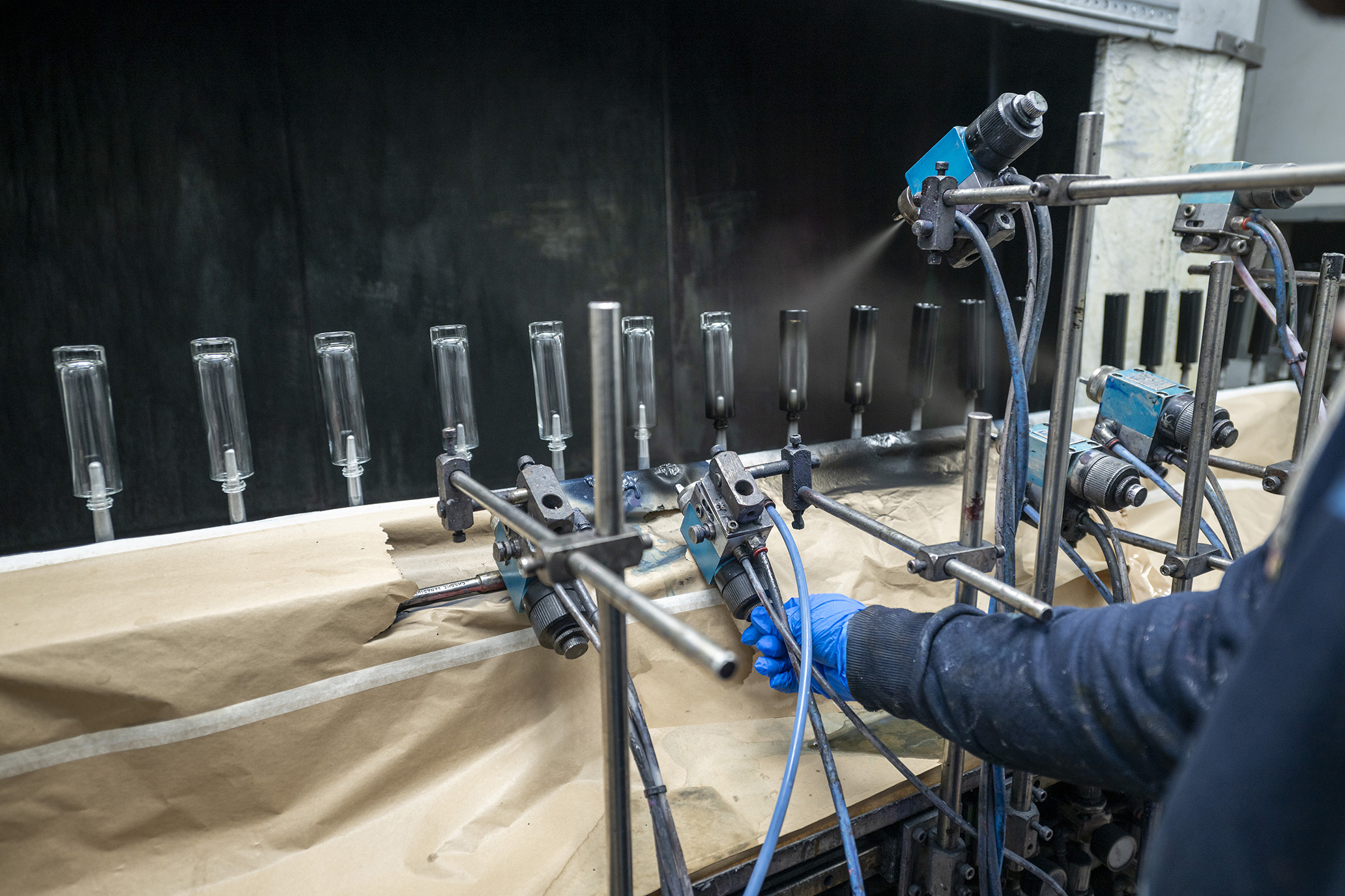
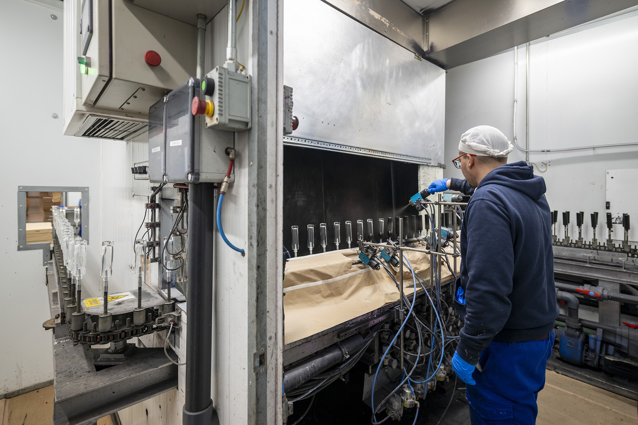
The foundation of the project is a semi-transparent gradient coating that transitions from intense reddish tones to a warm solar yellow. This technique, carried out at our painting station, offers several advantages:
To elevate the brand identity, we applied silver hot stamping for Saigu’s vertical logo. Unlike conventional screen printing, stamping provides:
The result is a vibrant, sophisticated container that is fully consistent with the brand's values. Further proof that at Serigrafia Portal, we know how to fuse technology and aesthetics so that every product tells its own story.